728x90
# 한국어 폰트 적용

import matplotlib
# matplotlib.rcParams['font.family'] = 'Malgun Gothic' # 윈도우즈의 '맑은 고딕'설정
matplotlib.rcParams['font.family'] = 'AppleGothic'    # 맥북 '애플 고딕'설정

matplotlib.rcParams['axes.unicode_minus'] = False
import matplotlib.pyplot as plt
import numpy as np
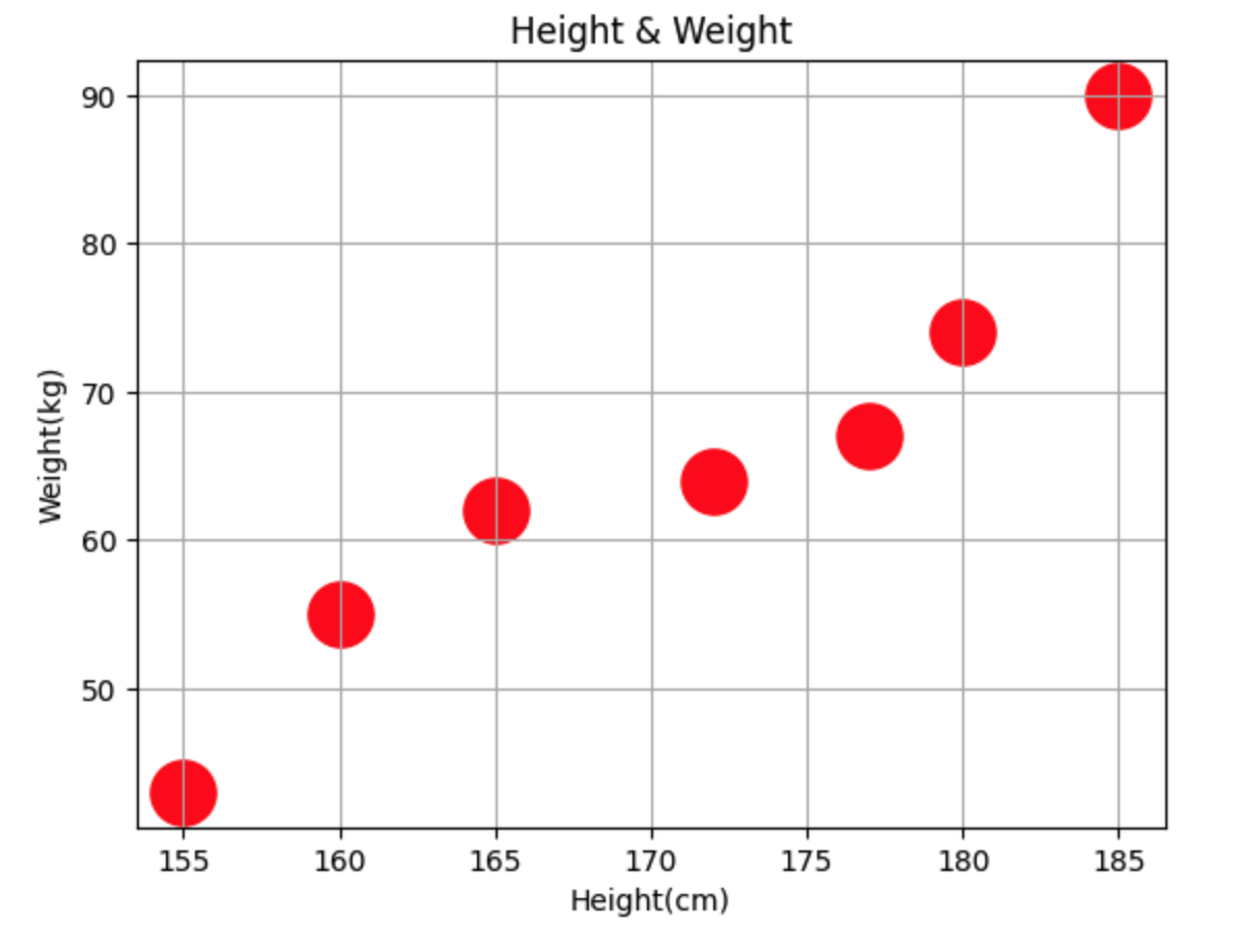
height = [165,177,160,180,185,155,172] # 키 데이터
weight = [62,67,55,74,90,43,64] # 몸무게 데이터
plt.scatter(height, weight)
plt.xlabel('Height(cm)')
plt.ylabel('Weight(kg)')
plt.title('Height & Weight')
plt.grid() # 그리드
plt.scatter(height, weight, s=500, c='r') # s: 마커크기, c: 색
plt.show()
# 마커 크기를 변경하는 방법

plt.scatter(height, weight, s=500, c='r') # s: 마커 크기, c: 색깔
plt.show()
# 데이터마다 마커의 크기와 컬러를 다르게 지정

size = 100* np.arange(1, 8)
colors = ['r', 'g', 'b', 'c', 'm', 'k','y']
plt.scatter(height, weight, s=size, c=colors)
height = [165,177,160,180,185,155,172] # 키 데이터
weight = [62,67,55,74,90,43,64] # 몸무게 데이터       # 165, 62가 1번째 Red -> 177, 67 Green 순서대로
plt.show()


import numpy as np

city = ['서울','인천','대전','대구','울산','부산','광주']

# 위도(latitude)와 경도(longitude)
lat = [37.56, 37.45, 36.35, 35.87, 35.53, 35.18, 35.16]
lon = [126.97, 126.70, 127.38, 128.60, 129.31, 129.07, 126.85]

# 인구밀도
pop_den = [16154, 2751, 2839, 2790, 1099, 4454, 2995]

size = np.array(pop_den) * 0.2 # 마커의 크기 지정
colors = ['r','g','b','c','m','k','y'] # 마커의 컬러 지정

plt.scatter(lon, lat, s= size, alpha=0.5)
plt.xlabel('경도')
plt.ylabel('위도')
plt.title('지역별 인구밀도')

for x,y, city_name in zip(lon, lat,city):
    plt.text(x,y, city_name) # 경도, 위도에 따른 도시이름 mapping


plt.show()
728x90
'AI > [Visualization]' 카테고리의 다른 글
| [Seaborn] Seaborn 그래프 형태 (0) | 2023.02.13 |
|---|---|
| [Matplotlib] Pie그래프 (0) | 2023.02.13 |
| [Matplotlib] 막대바 (0) | 2023.02.13 |
| [Matplotlib] 시각화 첫 단계 (0) | 2023.02.07 |