728x90
Seaborn은 Matplotlib의 기능과 스타일을 확장한 파이썬 시각화 도구의 고급버전이지만 쉽다.
# import library
import seaborn as sns

# 타이타닉 데이터셋 로딩
titan_df = sns.load_dataset('titanic')
회귀직선이 있는 산점도
import matplotlib.pyplot as plt
import seaborn as sns

# 스타일을 지정 - darkgrid
sns.set_style('darkgrid')
# 그래프 객체 생성 - 한 out에 그래프를 살펴보도록
fig = plt.figure(figsize=(15,5)) # 15: 가로길이 // 5: 세로길이
ax1 = fig.add_subplot(1,2,1) # 1 x 2 사이즈에서 1번째 (왼쪽에 위치함)
ax2 = fig.add_subplot(1,2,2) # 1 x 2 사이즈에서 2번째 (오른쪽에 위치함)
# 그래프 그리기 - 선형회귀선 표시 (fit_reg = True)
sns.regplot(x='age', y='fare',
data=titan_df,
ax=ax1)
# 그래프 그리기 - 선형회귀선 미표시 (fit_reg = false)
sns.regplot(x='age', y='fare',
data=titan_df,
ax=ax2,
fit_reg=False)
plt.show()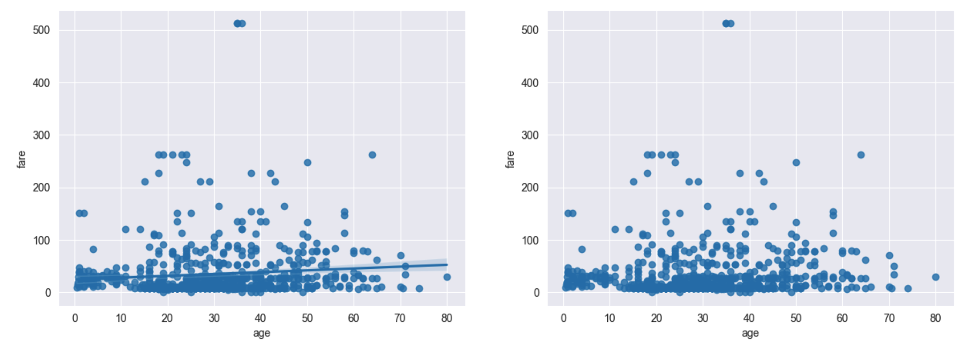
히스토그램 및 밀도함수
# 그래프 객체 생성 - 한 out에 그래프를 살펴보도록
fig = plt.figure(figsize=(15,5)) # 15,5 // 16,8
ax1 = fig.add_subplot(1,3,1)
ax2 = fig.add_subplot(1,3,2)
ax3 = fig.add_subplot(1,3,3)

# 기본값
sns.distplot(titan_df.fare, ax=ax1)

# hist = False
sns.distplot(titan_df.fare, hist=False, ax=ax2)

# kde = False
sns.distplot(titan_df.fare, kde=False, ax=ax3) # Kernel Density

# 차트 제목 표시
ax1.set_title('titan fare-hist/kde')
ax2.set_title('titan fare-hist')
ax3.set_title('titan fare-kde')

plt.show()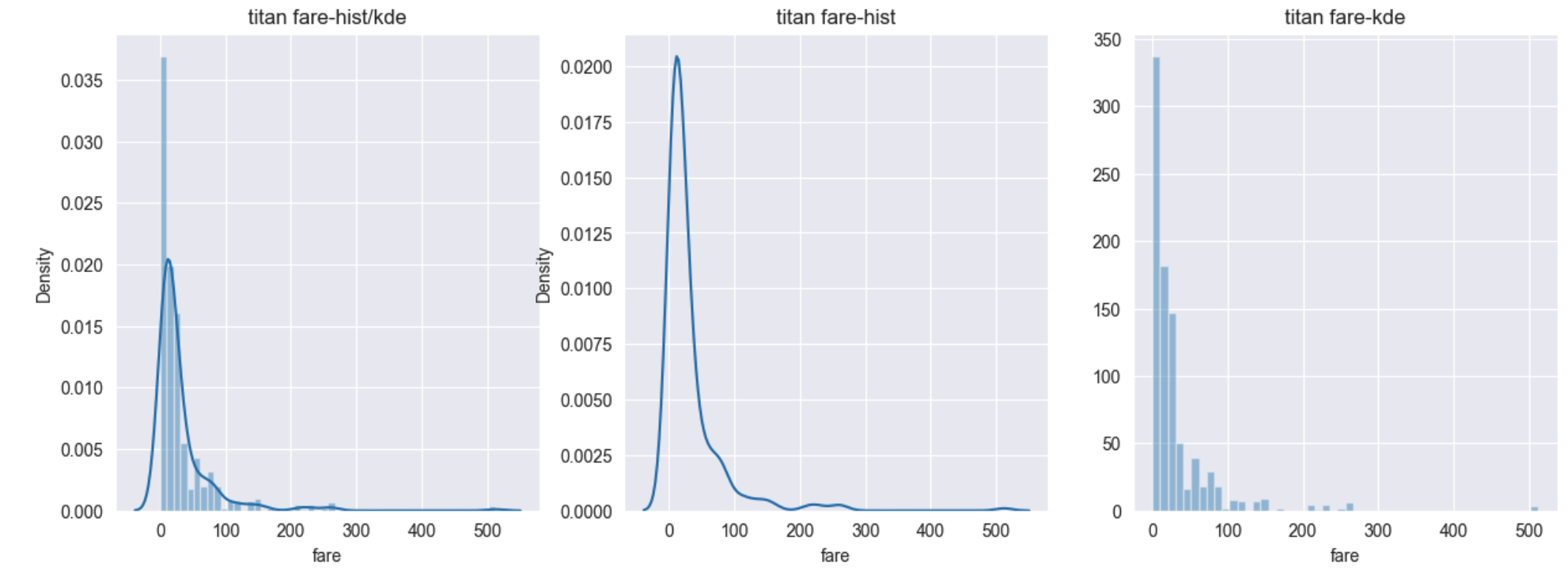
히트맵(Heat-map)
# 테이블 생성
table = titan_df.pivot_table(index=['sex'], columns=['class'], aggfunc='size')

# 히트맵 그리기
sns.heatmap(table,
           annot=True,
           fmt='d',
           linewidth=1) # heat-map을 쓰실때 cmap - color mapping :: heatmap_cmap의 종류
박스플롯 / 바이올린 플롯
import matplotlib.pyplot as plt
import seaborn as sns

# 데이터 로드
titan_df = sns.load_dataset('titanic')

# set_style theme
sns.set_style('whitegrid')

# 그래프 객체 생성
fig = plt.figure(figsize=(15,5))
ax1 = fig.add_subplot(2,2,1)
ax2 = fig.add_subplot(2,2,2)
ax3 = fig.add_subplot(2,2,3)
ax4 = fig.add_subplot(2,2,4)

# 박스플롯 - 기본값
sns.boxplot(x='alive', y='age', data=titan_df, ax=ax1).set(title='BOXPLOT')
      # .set(title='BOXPLOT') 타이틀 넣어주기 or 객체.set_title("타이틀")

# 박스플롯 - hue 변수 추가
sns.boxplot(x='alive', y='age', hue='sex', data=titan_df, ax=ax2).set(title='BOXPLOT + HUE')

# 바이올린 플롯 - 기본값
sns.violinplot(x='alive', y='age', data=titan_df, ax=ax3).set(title='VIOLINPLOT')

# 바이올린 플롯 - hue 변수 추가
sns.violinplot(x='alive', y='age', hue='sex', data=titan_df, ax=ax4).set(title='VIOLINPLOT+HUE')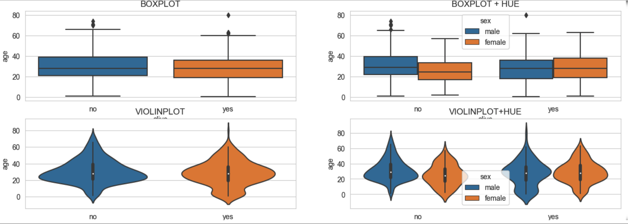
막대 그래프
# 그래프 객체 생성
fig = plt.figure(figsize=(15,5))
ax1 = fig.add_subplot(1,3,1)
ax2 = fig.add_subplot(1,3,2)
ax3 = fig.add_subplot(1,3,3)

# x축, y축에 변수 할당
sns.barplot(x='sex', y='survived', data=titan_df, ax=ax1)

# x축, y축에 변수 할당 후, hue 옵션 추가
sns.barplot(x='sex', y='survived', hue='class', data=titan_df, ax=ax2)

# x축, y축에 변수 할당 후, hue 옵션 추가 후 누적 출력
sns.barplot(x='sex', y='survived', hue='class', dodge=False, data=titan_df, ax=ax3)

# 차트 제목 표시
ax1.set_title('titan survived - sex')
ax2.set_title('titan survived - sex/class')
ax3.set_title('titan survived - sex/class(stacked)')

plt.show()
범주형 데이터의 산점도
import matplotlib.pyplot as plt
import seaborn as sns

# titan
titan_df = sns.load_dataset('titanic')

# set style theme
sns.set_style('whitegrid')

# 그래프 객체 생성
fig = plt.figure(figsize=(15,5))
ax1 = fig.add_subplot(1,2,1)
ax2 = fig.add_subplot(1,2,2)

# 이산형 변수의 분포 - 데이터 분산 고려를 안한다면(중복 표시 O)
sns.stripplot(x='class',
             y='age',
             data=titan_df,
             ax=ax1)

# 이산형 변수의 분포 - 데이터 분산 고려를 한다면(중복 표시 X)
sns.swarmplot(x='class',
             y='age',
             data=titan_df,
             ax=ax2)

# 차트 제목 표시
# ax1.set_title('Strip Plot')
# ax2.set_title('Swarm Plot')

plt.show()
728x90
'AI > [Visualization]' 카테고리의 다른 글
| [Matplotlib] Pie그래프 (0) | 2023.02.13 |
|---|---|
| [Matplotlib] 막대바 (0) | 2023.02.13 |
| [Matplotlib] 산점도 찍기 (0) | 2023.02.13 |
| [Matplotlib] 시각화 첫 단계 (0) | 2023.02.07 |